As a screen printing company, it is our job at Kick Print to make sure designs are balanced and pleasing to the eyes. One thing we noticed is how designs can be easily thrown off-balance by misusing alignment tools inside of design software.
So, here’s a quick tip of how to avoid alignment issues by using your eyes rather than relying on built-in-design tools.
Check the Bounding Box
Design programs encase text and shapes inside a Bounding Box and in some cases the bounding box is a few pixels outside of what you see visually. See below:
This can cause issues when relying on alignment tools, because the design program will align according to the box, NOT the actual text. See below: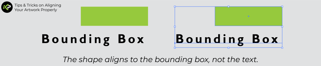
As you can see, if you relied on the alignment tool to right-align the black shape and the text, it would not look aligned visually.
Outline Text & Artwork
One way to avoid alignment issues is to Outline the text and artwork. This will place the bounding box snugly against the artwork. See below:
Now you can use the alignment tools knowing that there is no space between the artwork and the bounding box. 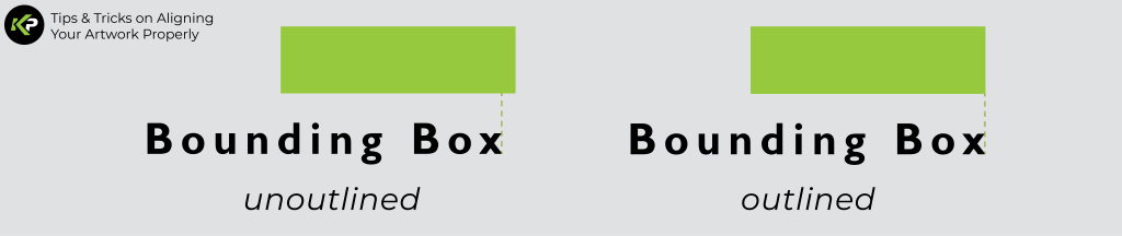
Align Based on Visual Weight & Balance
Instead of relying on alignment tools to perfectly align things, think about where the artwork rests visually. Try to align the bottom of text or shapes to another line or shape.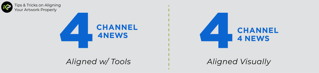
You can see here that aligning the bottom of the text with a line inside the “4” looks more visually balanced than aligning them with a tool. This is because the eye follows the line inside the “4” like it is a horizon, making the text look grounded instead of floating randomly.
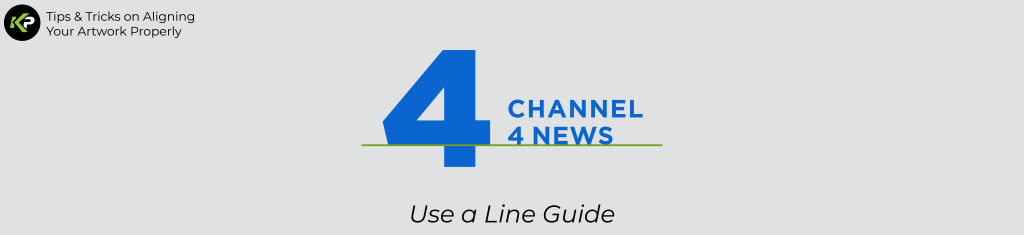
PRO TIP: Use a line as a guide to ensure that what you’re aligning is perfectly straight:
Conclusion
Alignment tools are nice shortcuts to use while designing, but beware- relying on alignment tools can cause issues or make your artwork look off.
If it seems like this is all overwhelming, you could always take advantage of Kick Print’s graphic design offers. We offer everything from logo & branding design to merch and apparel design.
Happy designing, and remember to trust your eyes!
-Kick Print team